Credit: Alamy & McDonald's
McDonald’s Flipped Its Arches To Make A Powerful Statement
McDonald’s flipped its arches upside down for a very important reason.
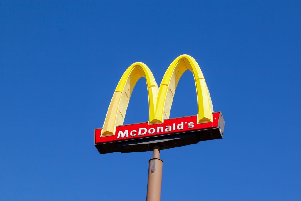
The fast food giant’s Golden Arches are among the most famous corporate logos in the world, recognized across cultures, languages, and generations.
So when the chain decides to alter the logo, even temporarily, it quickly catches the attention of customers and critics alike.
The history of the McDonald’s arches
The McDonald’s Golden Arches began as a piece of architecture rather than a logo.
In the early 1950s, brothers Richard and Maurice McDonald wanted their fast-growing restaurant to stand out from roadside diners across the US.
They worked with architect Stanley Meston to design two large, glowing yellow arches that were built into either side of the restaurant, forming a striking visual landmark that could be spotted by drivers from a distance.
At a time when car culture was booming, visibility mattered almost as much as the food.
As McDonald’s expanded through franchising, the arches became a recurring design feature, even when buildings varied in layout.
By the early 1960s, the company began simplifying its visual identity, and the two arches were merged into a single ‘M’ shape.
This marked the transition from architectural feature to corporate symbol, turning the arches into a shorthand for speed, consistency, and familiarity.
Over the decades, the arches became one of the most recognizable symbols in the world.
Today, the arches often appear without the company name at all, relying on instant recognition alone.
Why the arches are yellow
The choice of yellow was not accidental.
Yellow is one of the most visible colors in the spectrum, especially from a distance, which made it ideal for roadside restaurants competing for passing drivers’ attention.
In the early days, the arches were literally designed to glow, reinforcing the color’s ability to stand out day or night.
Psychologically, yellow is often associated with happiness, warmth, and optimism.
Branding experts have long noted that it can evoke feelings of friendliness and approachability, qualities McDonald’s wanted to project as it positioned itself as a family-friendly restaurant.
Yellow also pairs well with red, another core McDonald’s color, which is known to stimulate appetite and create a sense of urgency.
When and how the arches have been changed
Although the Golden Arches are usually kept consistent, McDonald’s has occasionally altered them for specific campaigns or symbolic gestures.
These changes are typically temporary and carefully controlled, designed to spark conversation without weakening brand recognition. Because the arches are so iconic, even minor adjustments tend to attract widespread attention.
In some cases, the arches have been modified to reflect local cultures or values in different countries. This might include stylistic tweaks, color variations, or design adaptations that align with regional tastes while keeping the core ‘M’ shape intact.
These changes reinforce McDonald’s global presence while acknowledging local identity.
There have also been rare moments when the arches were visually reworked to make a broader statement tied to company values or social themes.
Such instances stand out precisely because they are so uncommon. By occasionally bending its most famous symbol, McDonald’s demonstrates both cultural awareness and confidence in a logo strong enough to withstand reinterpretation without losing its meaning.
In social media and advertising, McDonald’s briefly displayed the arches pulled apart, symbolizing social distancing.
Logo change met with mixed reactions
When McDonald’s flipped its arches upside down, many people took to social media and reacted – many were ‘lovin” it.
One fan writes: “Love this from Mcdonald’s!”
Another adds: “This is so awesome!! Thank you, McDonalds!”
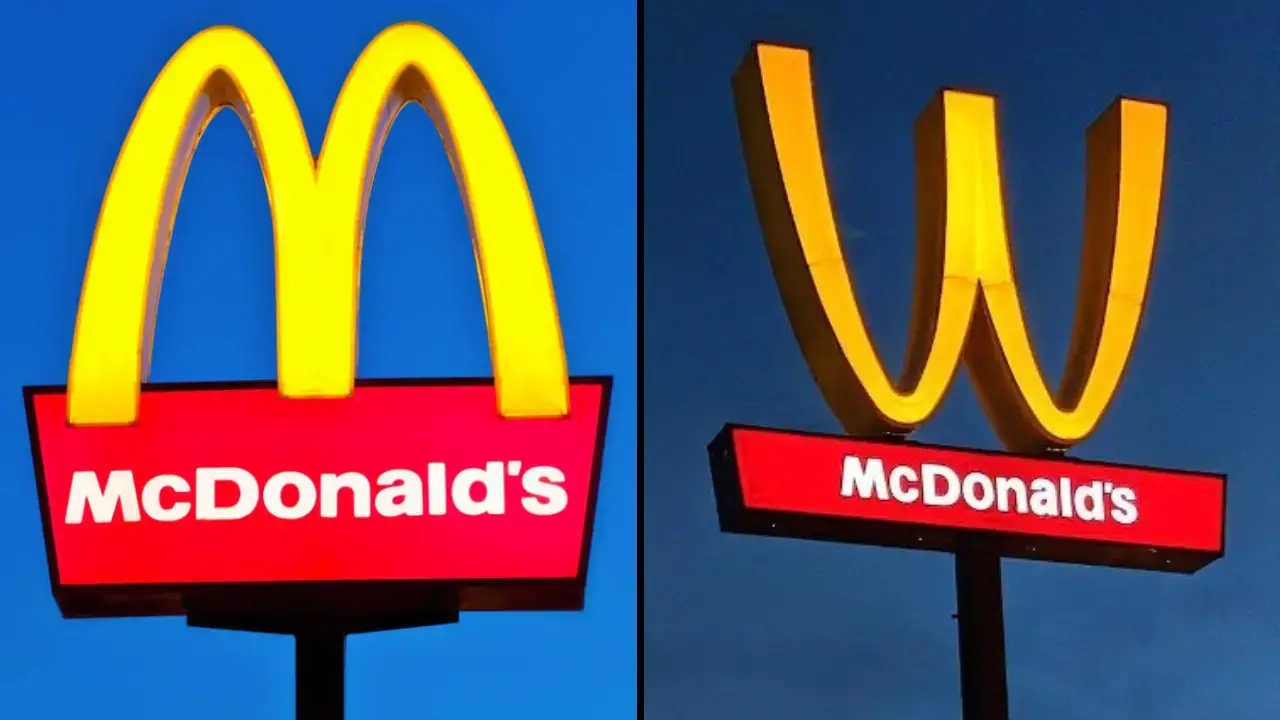
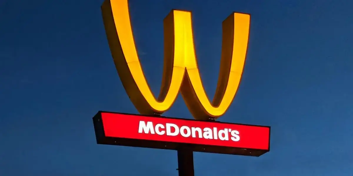
The fast-food giant flipped the logo upside down to mark International Women’s Day, switching the ‘M’ to a ‘W.’
However, McDonald’s efforts to mark the day haven’t been well received by everyone.
Laura Parker, the former national coordinator of the UK Labour Party-affiliated, left-wing group Momentum, told The Guardian: “This empty McFeminism has nothing to do with women’s liberation and everything to do with McDonald’s attempt to sanitise its image.”
While on Twitter, one user questions: “How much did this sign swap cost? How is that helping women? Cheaper than traditional advertising is likely the real deciding factor.”
A second simply says: “Try again.”
The logo flip was first seen at a McDonald’s in California, but it was later displayed across the company’s social media channels, on shirts, hats, and even special packaging at 100 American restaurants.
These initiatives aim to highlight the growing importance of gender equality and the need for continued progress.
By celebrating women and their achievements, brands like McDonald’s, Johnnie Walker, and Brawny are helping to raise awareness and promote positive change.
McDonald’s history of ‘supporting’ women
The company claims to have a long history of supporting women in the workplace and notes that six out of 10 McDonald’s restaurant managers in the US are women.
Every year on March 8, International Women’s Day is celebrated around the world, with the aim of recognising and celebrating the social, economic, cultural, and political achievements of women.
On the day in 2018 and 2019, McDonald’s uniquely celebrated the day by flipping its iconic golden arches logo upside down, creating a big, bubbly W.
The move is part of McDonald’s effort to show support for women everywhere.
McDonald’s chief diversity officer, Wendy Lewis, says that the logo flip is meant to honor the ‘extraordinary accomplishments of women everywhere and especially in our restaurants’.
She goes on to say that 60 per cent of McDonald’s restaurant managers being women in the US is a fact that the company takes a lot of pride in.
Whether seen as a meaningful tribute or a marketing exercise, McDonald’s logo flip once again shows the power of branding in shaping public debate.
As International Women’s Day continues to grow in prominence, companies are likely to face increasing scrutiny over how their values align with their actions.
Related Article: People Are Only Just Realising What The M&M Initials Actually Stand For
Related Article: McDonald’s Customer Slams It As ‘No Longer Affordable’ After Sharing Bill For Regular Order
Want more stuff like this?
Get the best viral stories straight into your inbox!
