Credit: Alamy
People Are Only Just Realizing There’s A ‘Hidden Message’ In The Iconic Adidas Logo
Adidas may be one of the most recognizable brands in the world, but it turns out there’s more to its iconic logo than meets the eye.
For decades, we’ve all seen the three stripes plastered on sneakers, jackets, and sports gear, but only recently have people started noticing that there might actually be a ‘hidden message’ tucked away in that simple, minimalist design.
The German brand has been a major player in the sportswear world since the 1950s, constantly innovating and setting trends for athletes and casual wear alike.
Over the years, Adidas has gone through plenty of changes – from new products to updated designs – and even the logos have evolved over time. Yet, despite all the shifts and transformations, the three stripes have remained at the very core of the company’s identity.
What’s really fascinating, though, is that something so familiar can still surprise us.
Many fans are only now realizing that Adidas’ logo isn’t just a random set of lines.
It’s a reminder that even the simplest things in design can carry meaning, and that sometimes we take everyday symbols for granted until someone points out the story behind them.

From brotherhood to global brands
Adidas started from very modest beginnings.
In 1924, two brothers from the small German town of Herzogenaurach, Adolf and Rudolf Dassler – known as Adi and Rudi – founded the Dassler Brothers Shoe Factory.
After parting ways with his brother in 1948, Adi Dassler went on to establish Adidas in Herzogenaurach, Germany.
Meanwhile, Rudi Dassler founded Puma, another globally recognized name in sportswear.
Becoming a global symbol
The story behind Adidas’ iconic three stripes is actually more intentional than many realize.
According to the Adidas website: “Stripes ended up on the first pair of Adidas shoes after Dassler had tested several versions and numbers of stripes and found that three simply showed up most prominently in photography.”
In other words, the stripes weren’t just a design choice – they were a way to make the shoes instantly recognizable. And recognizable it certainly became, helping Adidas cement its place as a global sportswear powerhouse.
The brand’s evolution didn’t stop at shoes.
Adidas notes: “In 1972, the world turned to Germany when the Olympic Games opened in Munich. Just in time for the event, Adidas presented a new logo that was here to stay: the Trefoil, symbolizing performance. Inspired by florals, the new logo featured three leaf-shaped foils to stay consistent with Adidas notoriety as the brand with the three stripes.”
This Trefoil logo added a fresh, recognizable symbol to Adidas’ identity, connecting the company’s heritage with its forward-looking vision.

Since the year 2000, all Adidas Originals items now bear this logo to pay homage to the brand’s history, creating a sense of continuity between past and present.
Beyond sports, Adidas has woven itself into the fabric of pop culture.
The brand has collaborated with a wide range of celebrities, from soccer star David Beckham to the hip-hop group RUN D.M.C., bringing its signature style to new audiences and cultural movements.
As the company states: “Today, the Adidas Originals collection stands for lifestyle and street. Times may change, but trefoiled quality will always remain.”
This sentiment captures the enduring appeal of Adidas: a brand that has successfully balanced performance, style, and cultural relevance for decades.
The evolution of the modern logo
In 1989, Adidas decided it was time to refresh its visual identity and explore new design directions.
To help with this, the company approached Peter Moore, a designer whose groundbreaking work on the Nike Air Jordan campaign had already turned the world of sneakers on its head.
Moore brought a fresh perspective and deep understanding of sneaker culture, making him the perfect collaborator for Adidas’ next chapter.
By 1991, Moore teamed up with Rob Strasser, another veteran from Nike, to develop the Adidas Equipment, or EQT, line.
This collection represented a new era for Adidas – performance-driven, technically innovative, and forward-looking, while still honoring the brand’s heritage. The EQT line showcased Adidas’ ability to evolve and experiment with design without losing the essence of what made it iconic in the first place: quality, performance, and unmistakable style.
This period highlighted Adidas’ dual identity: on one hand, it remained a performance-focused sports brand; on the other, it was cementing itself as a lifestyle and streetwear icon.
By balancing these two worlds, Adidas has continued to influence everything from athletic gear to fashion trends, staying relevant across generations while holding true to its roots.
Moore didn’t just help shape a new product line – he also brought to life one of the most iconic iterations of the Adidas logo to date.
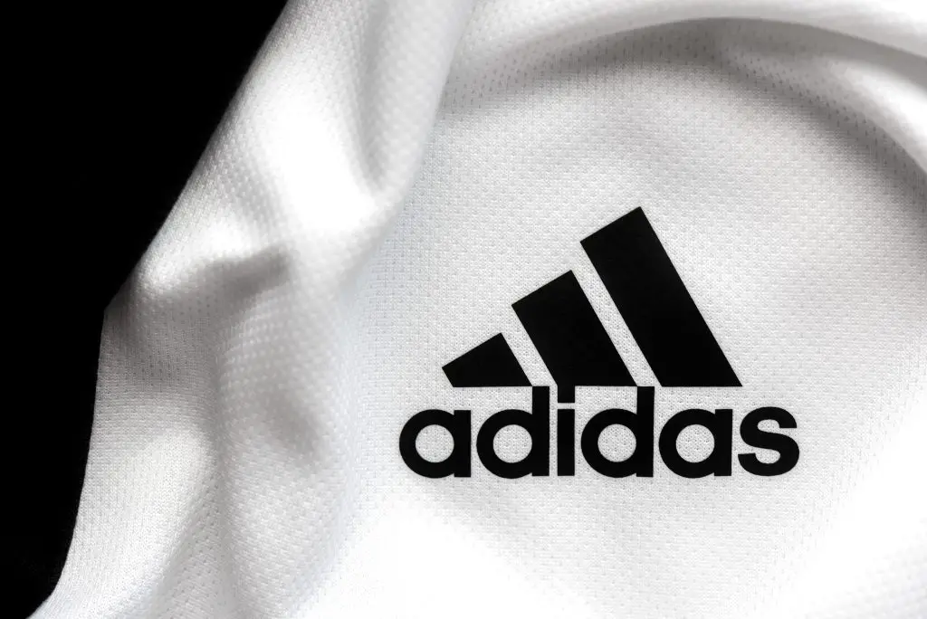
The logo for the Equipment (EQT) line is often referred to as the ‘mountain logo,’ and it’s the version that modern consumers are most likely to recognize. Its clean, bold lines immediately convey strength and performance, but there’s more to it than meets the eye.
According to Hatchwise, this familiar logo carries a little-known ‘hidden message.’
The slight angle of the three stripes in the EQT design has been interpreted as ‘associated with obstacles to overcome during your work to achieve your athletic goals.’ In other words, the logo is seen by many as reflecting the journey of effort, perseverance, and triumph that athletes experience in pursuit of excellence.
Tailor Brands offers a similar interpretation, suggesting that the EQT logo represents ‘the challenges athletes face and the goals to be achieved.’
More than just a logo
It’s a subtle but powerful way of embedding motivation directly into the brand’s visual identity. This attention to detail shows that Adidas doesn’t just make products for athletes – it creates symbols that capture the mindset, struggle, and triumph inherent in sports.
By combining innovative design with meaningful symbolism, the EQT logo has become more than just a mark on a shoe or a jacket. It’s a visual reminder of determination and achievement, connecting consumers to the essence of Adidas’ performance-driven heritage while also appealing to the lifestyle and street culture that the brand now embraces.
Fans have been intrigued by the subtle symbolism behind the EQT logo, with many taking to social media to share their reactions.
One pens: “Woah, so clever!”
Another admits to having misunderstood the design for years: “I always thought it was an A! So wrong,” they write, showing just how easily the symbolism can fly under the radar.
And a third sums up the collective amazement perfectly: “Mind blown,” they agree.
Related Article: Realization About Vans Logo Is Leaving People Mindblown And They Can’t Unsee It
Related Article: Nike Fans Are Only Just Discovering Dark Truth About Brand’s Slogan And Its Connection To Death Row
Want more stuff like this?
Get the best viral stories straight into your inbox!
